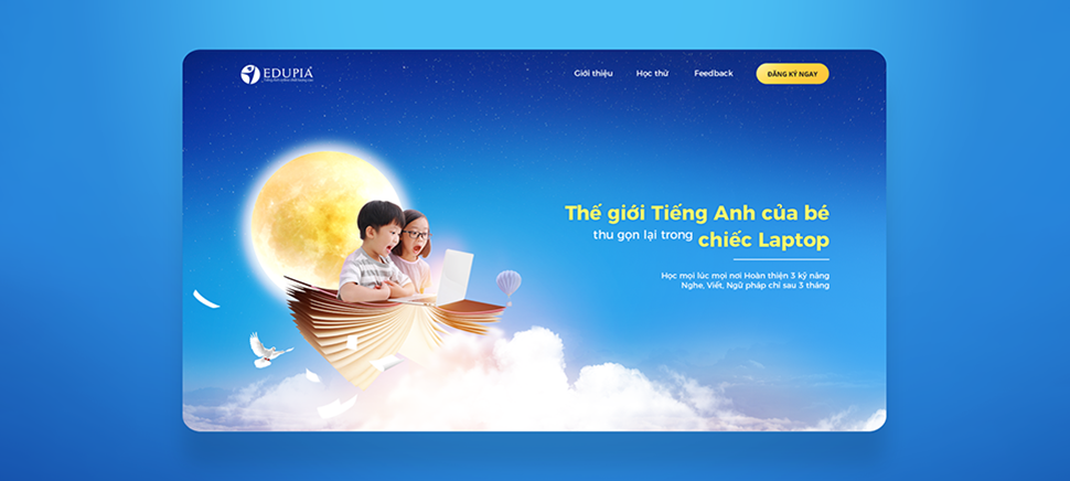
EDUPIA English Center’s landing page
Present an overview of EDUPIA English Center and their courses for elementary students.
Collect visitor’s information via the registration form on the page.
Technologies:Photoshop, Illustrator
In this project we engaged in content creation and overall interface design.
Aiming at parents and children as potential customers, a minimal, modern with fresh colors design was expected. A lot of hard work was put into the page’s image, and right from the first section our unique slogans and videos have conveyed a strong impression.
By applying 4H and HSSBC rules in controlling layout and content order, we have properly delivered the general concept of EDUPIA as well as detailed information about each course to the user.
